
what do y'all think?
http://www.airliners.net/addphotos/big/ ... 100909.jpg


what do y'all think?
http://www.airliners.net/addphotos/big/ ... 100909.jpg
Have you ever seen a grown man naked?
Blurry and soft.Originally Posted by flyboy 28
my first hugeness cockpit edit....

Have you ever seen a grown man naked?
Looks pretty darn good to my non-screener eyes. If I could only read what the belly strobe interferes with ...my first hugeness cockpit edit....


Sergio has been a huge Delta Air Lines fan since 1992!!
Sergio Cardona
http://www.jetphotos.net/showphotos....e=1&display=15
Keep in mind, these photos have not been touched with an editor. Also, for some reason, they appear clearer in the original file. I'm sure some (if not all) need editing, but I need recommendations on how to go about that.
http://www.flickr.com/photos/47849042@N05/
712 733 734 735 737 738 744 752 753 763 764 772 A319 A320 A346 MD82 MD88 MD90
I like all 3 of those shots and I would say that they have good potential.
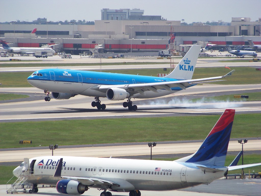
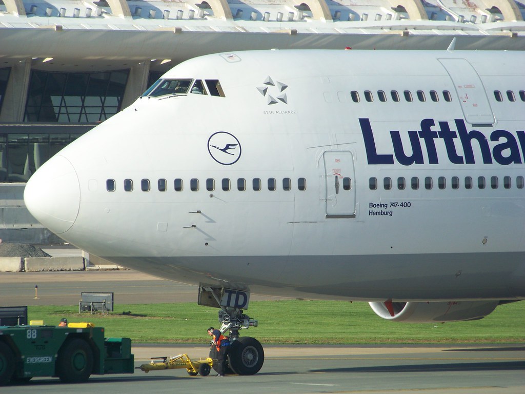
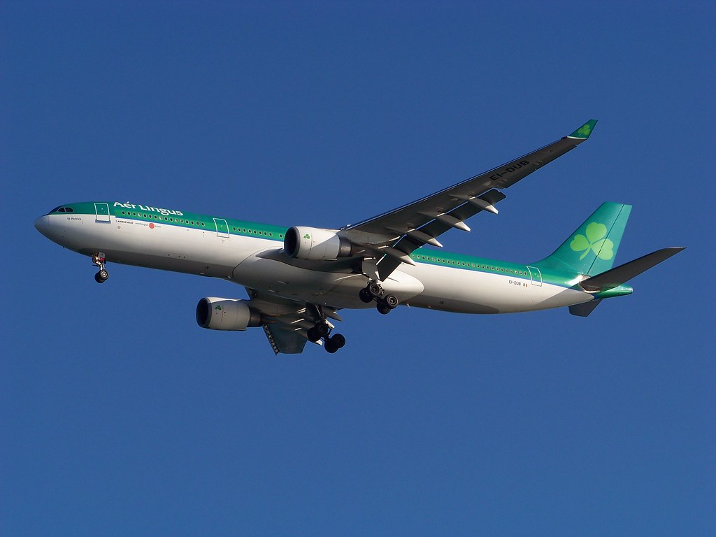
My main comment: If you want to successfully load to a.net or jetphotos, watch your aspect ratio. Both of those sites will want pictures in the range of 3:2 to 4:3. The KLM shot looks too square. Lufthansa looks like it might be close to 4:3, but you'll want to check it. Lingus has lot of dead space - crop to 3:2 and lose as much dead space as you can.
On my current monitor, your exposures look decent - KLM is back lit but I like it anyway. KLM also looks like it is in need of some sharpening.
Lufthansa doesn't need much sharpening in my opinion, but a.net might give you a hard time becuase of the person in the pic.
Best of luck,
Dan


Thinking about trying this one. Not sure what happened to the RR logo on the enging though. I resized this one after I cropped it before I started editing it. Anyone have any solutions and feed back on this edit?

http://brandonsaviationblog.blogspot.com/ My continuing updated Aviation Blog
http://www.flickr.com/photos/seahawks7757/ My continuing updated photostream from BFI and sometimes SEA

I'm thinking way too oversharpened, and too much contrast. Knowing the sites guidelines, it's probably too low in the frame as well.

It's also very noisy and could use some cw rotation. As far as the contrast goes, start back with your original shot and pay close attention to your histogram.
R.I.P. Matt Molnar 1979-2013
#DeleteThePickleSmoocher
LETS GO CAPS!
[URL]http://www.sopicturethis.net[/URL]
ok, might scrub this one beacuse I shot it low and that is as centered as she is going to get and JP I know hates that, so I'll see what I do tonight.
http://brandonsaviationblog.blogspot.com/ My continuing updated Aviation Blog
http://www.flickr.com/photos/seahawks7757/ My continuing updated photostream from BFI and sometimes SEA
Any advice with this one. It has been rejected twice due to horizon unlevel. I have now rotated it so that the light posts are vertical.
http://www.jetphotos.net/viewqueued_b.php?id=2959351
Thanks
I am working on a few 787 shots again. Some of these are first releases-

http://brandonsaviationblog.blogspot.com/ My continuing updated Aviation Blog
http://www.flickr.com/photos/seahawks7757/ My continuing updated photostream from BFI and sometimes SEA
I submitted the first and third
http://brandonsaviationblog.blogspot.com/ My continuing updated Aviation Blog
http://www.flickr.com/photos/seahawks7757/ My continuing updated photostream from BFI and sometimes SEA
Any chance for this?

Sergio has been a huge Delta Air Lines fan since 1992!!
Sergio Cardona
http://www.jetphotos.net/showphotos....e=1&display=15
 Posting Permissions

 Reply With Quote
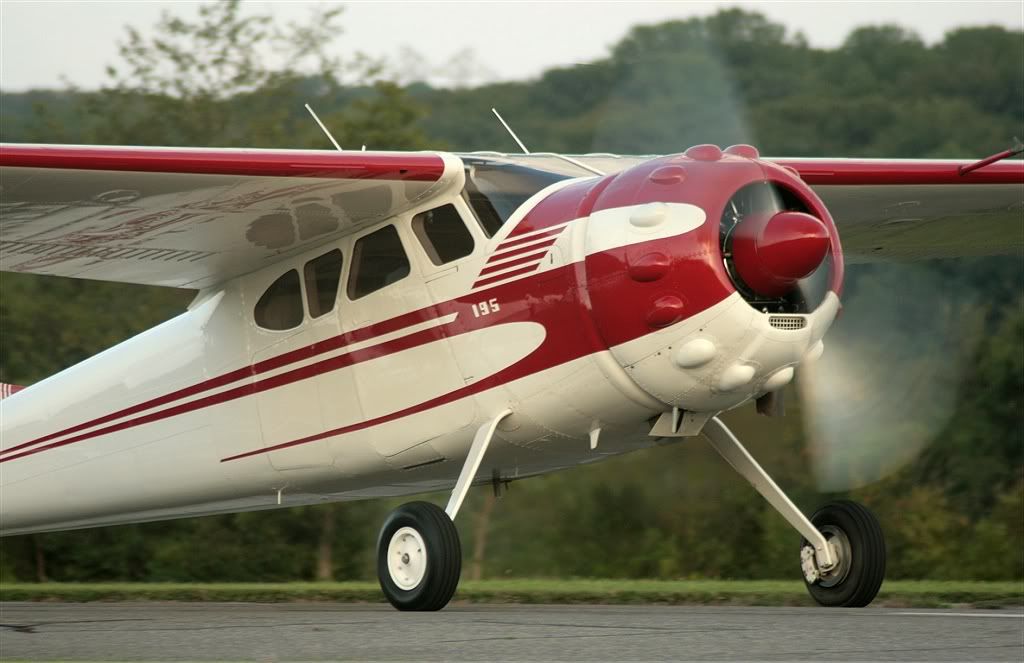


Bookmarks