
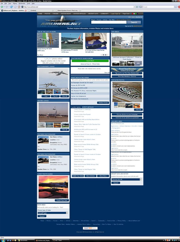
The airliners.net homepage is changed.... I don't like it. Screw Demand Media turning it into one of their other sites..... Gagh!
P.s. if your ISP's cache hasn't updated yet, here is the new look:


The airliners.net homepage is changed.... I don't like it. Screw Demand Media turning it into one of their other sites..... Gagh!
P.s. if your ISP's cache hasn't updated yet, here is the new look:
nwa FOREVER!
They changed it for a brief period yesterday as well, it is definitely not an improvement from the current one. Its much harder to navigate, and is not eye pleasing whatsoever. From a designers point of view, this isn't such a smart move.
Wow there's the last nail in that coffin... Man it really looks bad..the fonts are terrible, hard to read, and cheap looking. It should be interesting to see the fire storm this causes, lol

that is disgusting. :oops:
it is mathematically impossible for either hummingbirds, or helicopters to fly. fortunately, neither are aware of this.


I think it's much more cleaner and organized than the previous one....which was a big mess of everything on the page.
As we are rebuilding our own site here, I'd like to learn exactly what you like and dislike in detail.
Email me anytime at [email protected].
Please, not what A.net did...Originally Posted by Phil D.
Phil, iffin it ain't broke...
R.I.P. Matt Molnar 1979-2013
#DeleteThePickleSmoocher
LETS GO CAPS!
[URL]http://www.sopicturethis.net[/URL]
You're right. I think the previous site was messy, but people were used to it. I do think the new page is a bit cleaner, but it wasn't necessary. It doesn't look very professional either.
Email me anytime at [email protected].

It really doesn't look professional at all, there is way too much on the home page.
Facebook looks light years more professional then the new site does.
i think they did themselves in when they got rid of this:
maybe i'm too simple a person for my own good but i actually liked the original layout of the siteway back in the day. everything was on the first page and the site focussed on the pictures taken by photog around the world. yes they do that now as well, but it's gone far beyond just pictures. the front page of the site has been flooded with content that was never intended to be on the site in the first place. the site in an of itself contributes to the competition of the "spotter community." thier current "logo" only shows the favoratism that runs rampent throughout the site.
it is mathematically impossible for either hummingbirds, or helicopters to fly. fortunately, neither are aware of this.
I don't hate it. But it's certainly not an improvement. And even if it is broke, don't fix it unless you can really fix it :P
Its really cheap looking, very unorganized, and too long
I hate it, plain and simple, not eye-pleasing and just cheezy. Even the a.net crew doesn't like it that much
"lol retart"
I'm sure much of the a.net crew is embarrassed, I know I would be if I was one of them.
What a Train-Wreck the new front page is, just horrible. I think this may become a bigger black eye for demand media than the photo use fiasco some time back. And what they should do is realize they broke something that wasn't broken and admit they screwed up and just change it back (that's what I would like) but their ego is probably to big and their respect and knowledge of their customer base is to small for them to probably do that. I know Johan made out very well in the site's sale but still I would love to see the look on his face when he first saw the new front/home page. I'll bet Chris Kilroy loves it though, he must be estatic.
Cheers
LGA777
Man JP just keeps getting stronger every day!
"lol retart"
 Posting Permissions

 Reply With Quote
Bookmarks