Page 51 of 92 FirstFirst ... 4147484950515253545561 ... LastLast
Results 751 to 765 of 1369

Thread: Post Your Recent REJECTIONS!

  1. #751
    Senior Member seahawks7757's Avatar
    Join Date
    Mar 2010
    Location
    Edgewood, Washington, United States
    Posts
    1,241
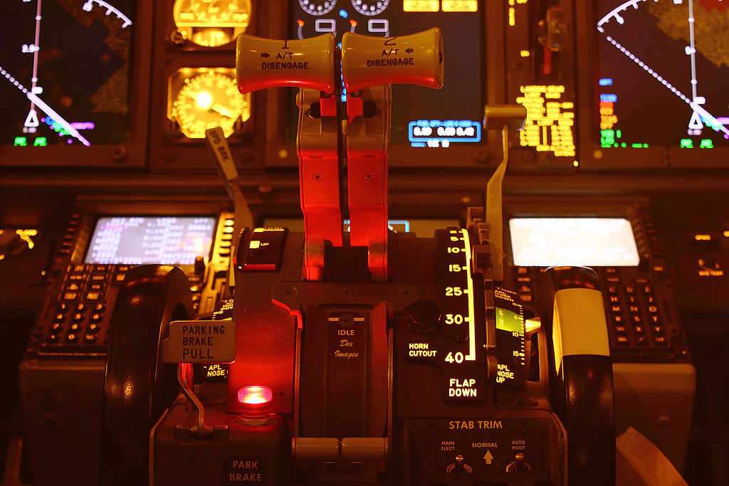
    All I can say is I am very bitter with A.Net right now on the rejection of this shot. They rejected it for Red and Contrast flat which is crap. I have no control over the red light as that is what the pilot had on when I took this shot and also kinda makes this shot more epic. I attempted to appeal but the head screener was just as much of an idiot as the original. And trust me this is the nice version of me holding back how I really feel on this-
    http://brandonsaviationblog.blogspot.com/ My continuing updated Aviation Blog
    http://www.flickr.com/photos/seahawks7757/ My continuing updated photostream from BFI and sometimes SEA

  2. #752
    Senior Member hiss srq's Avatar
    Join Date
    Dec 2005
    Location
    Around here and near there.
    Posts
    5,565
    Apparently the natrually existing effects of a light in a cockpit are too low for Anet standards.. what is the site trying to do... be in home and gardens or show people airplanes
    Southwest Airlines-"Once it pop's it's time to stop" Southwest Airlines-"Our Shamu's are almost real" Southwest Airlines -"We blow our top real easy" Southwest Airlines- "You can't top us..... really"

  3. #753
    Senior Member gonzalu's Avatar
    Join Date
    May 2009
    Location
    The Bronx, New York
    Posts
    6,028
    Brandon, I have been there many times with far less challenging decisions: SUNSET SHOTS. Do we balance for daylight and correct shade of golden on white bodies or do we balance for a white body? I have lost and won on both counts. I have been rejected for improper WB with both full gold white body under sunset lighting and also rejected for WB for white body under sunset lighting. I have been less sensitive lately given that I have about 1,000,000 shots still to submit LOL.

    Your image does sort of have an overall RED GLOW that is why they likely rejected. Perhaps a slightly less glowing red overall will get accepted. I tried below two different versions of yours by simply playing with the levels.

    Your Original


    Compressed Red Chanel


    Further compressed REED channel and boosted midtones under BLUE and GREEN channels


    The original file may have a lot more latitude. Also feel free to try the PHOTO filters under PSCS and try hints of blue and see what happens.
    Manny Gonzalez
    Thrust Images | General Photography | R.I.P. Matt Molnar 1979-2013
    BRING BACK THE KJFK/KLGA OBSERVATION DECKS

  4. #754
    Senior Member gonzalu's Avatar
    Join Date
    May 2009
    Location
    The Bronx, New York
    Posts
    6,028
    Also, for controlled shots like these, you may want to add one of these


    and see if it looks any different calibrated to it and not.
    Manny Gonzalez
    Thrust Images | General Photography | R.I.P. Matt Molnar 1979-2013
    BRING BACK THE KJFK/KLGA OBSERVATION DECKS

  5. #755
    Senior Member NIKV69's Avatar
    Join Date
    Apr 2005
    Location
    IFP, ISP, JFK, IGM, SAN, VCV, LGA, LAX, SEE, LAS
    Posts
    4,258
    Good work Manny! Brandon insulting the screeners won't go far in your future with uploading there. As far as they go Gary and Mick are far from idiots and in fact know what they are looking at. I liked the Red in the shot myself but it was flat. Rather than spew the insults you may have a shot at getting the pic in by listening to Manny and stopping the negative energy.
    'My idea of a good picture is one that's in focus and of a famous person doing something unfamous.' Andy Warhol

  6. #756
    Senior Member gonzalu's Avatar
    Join Date
    May 2009
    Location
    The Bronx, New York
    Posts
    6,028
    Brandon, you can also MASK the red light from the edits I made to make [it] stay red rather than the bluish it turned when I messed with the channels :-)
    Manny Gonzalez
    Thrust Images | General Photography | R.I.P. Matt Molnar 1979-2013
    BRING BACK THE KJFK/KLGA OBSERVATION DECKS

  7. #757
    Senior Member seahawks7757's Avatar
    Join Date
    Mar 2010
    Location
    Edgewood, Washington, United States
    Posts
    1,241
    Nikv I will glady have that conversation in pm if you like as I do not want to go see another thread down the tubes for arguing but I respectfully disagree with your post. The site has flaws and that is a reason I prefer sites like Airplane-pictures.net that appreciate stuff like creativity and what not. If I was to get banned from A.Net I would lose no sleep over it as it would just confirm what I already feel and believe about the site. Although thank you for the compliment on the shot.

    Thanks Manny as I know you mean well by attempting to fix it but I personally prefer the original and it will just be another loss for A.Net.

    Also had 5 rejected for soft today, I would wish that the screeners would actually tell you where the photo is "soft" at, cause there is no way it is the whole photo. I mean when it comes to AS and QX planes I can only sharpen so much before the parallel running lines down the fuselage start getting distorted. May Nicv since you seem to know people over there and work with them you could maybe suggest that. I do mean that in a respectful way.
    http://brandonsaviationblog.blogspot.com/ My continuing updated Aviation Blog
    http://www.flickr.com/photos/seahawks7757/ My continuing updated photostream from BFI and sometimes SEA

  8. #758
    Senior Member gonzalu's Avatar
    Join Date
    May 2009
    Location
    The Bronx, New York
    Posts
    6,028
    Brandon, no sweat man... it was just another option :-) Anyway I know how you feel ... there are lots of times I wonder about sharpening and even color itself. It is SOOO subjective. I spent about a half hour the other day at HoBe while waiting for 31L departures bored to death, I decided to play around with WB... OMG, I could NOT GET certain colors right no matter what I tried LOL. I used one of the US Parks Dept. signs that are painted a special shade of Teal with two different light/dark tones. I would not get what my eyes saw... no matter what I did.

    I too have had soft and oversharpened shots where I wouldn;t know how far to go one way or another. The lack of explanation comes from TIME... they have thousands of entries and not enough time.

    Do you have responsibility for managing people at your job? I do and I have to sometimes look through Resumes... I can tell you that A LOT go in the garbage sight unseen for such subtleties as wrong font... I never even look to see if the candidate is strong... it is unfair and it is the way it is... there is simply no time!

    Well, I really hope you do not stay off A.net and continue to contribute your fine images... I have been blown away by some of your stuff. And try and enjoy the ones that HAVE and DO get accepted :-)

    Merry Christmas
    Manny Gonzalez
    Thrust Images | General Photography | R.I.P. Matt Molnar 1979-2013
    BRING BACK THE KJFK/KLGA OBSERVATION DECKS

  9. #759
    Senior Member NIKV69's Avatar
    Join Date
    Apr 2005
    Location
    IFP, ISP, JFK, IGM, SAN, VCV, LGA, LAX, SEE, LAS
    Posts
    4,258
    Nikv I will glady have that conversation in pm if you like as I do not want to go see another thread down the tubes for arguing but I respectfully disagree with your post. The site has flaws and that is a reason I prefer sites like Airplane-pictures.net that appreciate stuff like creativity and what not. If I was to get banned from A.Net I would lose no sleep over it as it would just confirm what I already feel and believe about the site. Although thank you for the compliment on the shot
    Arguing is fine and in fact productive but you went past that into disrespecting and insulting the screeners which now will be counter productive. Instead of feeling like your being attacked (your not) you should listen to some advice that is being given to you as way to help. Everyone here has been through the "anet is flawed" "Anet does not want creative shots" stuff. If you continue to let this be the mindset your just going to drive yourself nuts. The way you speak it's hard to get an idea of what you are looking for but to still upload to anet a different approach will yield better results. I have seen it work trust me, just as I have seen people poison themselves by alienating themselves with the screeners and not looking at their pictures objectively as you are doing now.

    The pics you have posted are indeed top notch but some of the quality is not anet standards. This is not a conspiracy. It's just fact. As stated your cockpit shot had a quality issue. Flat and color. Yet can be fixed. Manny has you on your way and your efforts would pay of big time. Now one could just upload it to airplanepicures and keep cursing anet but long term that will not yield the results your looking for. Your choice.
    'My idea of a good picture is one that's in focus and of a famous person doing something unfamous.' Andy Warhol

  10. #760
    Senior Member gonzalu's Avatar
    Join Date
    May 2009
    Location
    The Bronx, New York
    Posts
    6,028
    I am not sure but I can't see any JPG artifacts. If they are there, they must be minor :-( Oh well.. I appealed. Let's see what happens.

    Manny Gonzalez
    Thrust Images | General Photography | R.I.P. Matt Molnar 1979-2013
    BRING BACK THE KJFK/KLGA OBSERVATION DECKS

  11. #761
    Senior Member JDANDO's Avatar
    Join Date
    Oct 2009
    Location
    KMSP, KANE
    Posts
    863
    Quote Originally Posted by gonzalu View Post
    Do you have a larger version of it online we can take a look at? hard to tell at this size.


    Manny, here is a link to a larger file. I shot RAW and this is converted file, no edits.

    I am thinking it suffered a bit from shrinking it down to 1024 wide. Any workflow tips/techniques appreciated.

    Big picture
    Jeremy in Minnesota

    My pictures on jp.net

  12. #762
    Senior Member gonzalu's Avatar
    Join Date
    May 2009
    Location
    The Bronx, New York
    Posts
    6,028
    Jeremy,

    Thank you for the original. Yes, I see a lot of Chromatic Aberrations... especially on the edges of the image :-( What lens? In any case, This will be a difficult image to get accepted. You absolutely need as sharp and motion-blur-free originals as possible. While you can get away with minor motion blur or even OOF shots, CA is a bitch to hide ... even when resizing. CA also has a huge impact on overall sharpness perception. And remember, sharpness is a perceptive beast as well as physical :-)

    The image is also slightly overexposed (at least to my taste) but luckily there is enough data left in the whites with detail...

    So I played a bit... workflow:

    --Open image, crop and rotate. I used the columns on the building to get as close to horizontal as possible
    --Check for dust. Clean up anything that may be considered dust
    --Mask the plane. This is my personal taste. I work a bit harder on getting a good clean mask of the plane and then save it as a channel. Never know when you will need it again LOL.
    --Levels. I will usually manually set my channel levels. I remove all non existing data from each channel from both the highlights and the shadows side of the histogram. This will also have a side effect of balancing the colors. If they were way off or way close, you can tweak it further with the center eye dropper on the RGB channel. On this image I also moved the midtones slider way down to decrease the brightness in the highlights without loosing detail. Look especially at the node of the plane and also the engine nacelles. You will see extra details there
    --Resize to 1024, BiCubic
    --Layer Copy
    --Sharpen, USM, 200,0.2,0. Three times for this image which is overkill for the entire image...
    --Mask the areas that need less sharpening from those areas that need it more. In your case, I masked the buildings and runways about 50% and then 75% of the titles... I left the nose and tail at 100% USM.

    Let me know what you think... again, this is VERY SUBJECTIVE! There is no one way or perfect way.


    Your original resized to 1024 for comparison

    Manny Gonzalez
    Thrust Images | General Photography | R.I.P. Matt Molnar 1979-2013
    BRING BACK THE KJFK/KLGA OBSERVATION DECKS

  13. #763
    Senior Member gonzalu's Avatar
    Join Date
    May 2009
    Location
    The Bronx, New York
    Posts
    6,028
    I also wanted to point out there was NO color balancing other than via levels and also no saturation edits or even brightness and contrast. All I did was via the LEVELS controls. If I had the RAW file I may do some more with highlight protection and shadow boost but again, that's to my taste. I don't like SUPER CONTRASTY images. I like some detail in the shadows to show through :-)
    Manny Gonzalez
    Thrust Images | General Photography | R.I.P. Matt Molnar 1979-2013
    BRING BACK THE KJFK/KLGA OBSERVATION DECKS

  14. #764
    Senior Member gonzalu's Avatar
    Join Date
    May 2009
    Location
    The Bronx, New York
    Posts
    6,028
    One more bit of personal opinion. I really think a 1024px image is A LOT MORE challenging than output at 1600px edit. You have more room at 1600 to show off details without resorting to trickery and without oversharpening. The border between SOFT|SHARP|OVER on 1024 is a lot narrower than at 1600px... I like 1200-1400 as a happy medium. I hate when I am restricted to 1024. ;-)
    Manny Gonzalez
    Thrust Images | General Photography | R.I.P. Matt Molnar 1979-2013
    BRING BACK THE KJFK/KLGA OBSERVATION DECKS

  15. #765
    Senior Member JDANDO's Avatar
    Join Date
    Oct 2009
    Location
    KMSP, KANE
    Posts
    863
    Quote Originally Posted by gonzalu View Post
    Jeremy,

    Thank you for the original. Yes, I see a lot of Chromatic Aberrations... especially on the edges of the image :-( What lens? In any case, This will be a difficult image to get accepted. You absolutely need as sharp and motion-blur-free originals as possible. While you can get away with minor motion blur or even OOF shots, CA is a bitch to hide ... even when resizing. CA also has a huge impact on overall sharpness perception. And remember, sharpness is a perceptive beast as well as physical :-)

    The image is also slightly overexposed (at least to my taste) but luckily there is enough data left in the whites with detail...

    So I played a bit... workflow:

    --Open image, crop and rotate. I used the columns on the building to get as close to horizontal as possible
    --Check for dust. Clean up anything that may be considered dust
    --Mask the plane. This is my personal taste. I work a bit harder on getting a good clean mask of the plane and then save it as a channel. Never know when you will need it again LOL.
    --Levels. I will usually manually set my channel levels. I remove all non existing data from each channel from both the highlights and the shadows side of the histogram. This will also have a side effect of balancing the colors. If they were way off or way close, you can tweak it further with the center eye dropper on the RGB channel. On this image I also moved the midtones slider way down to decrease the brightness in the highlights without loosing detail. Look especially at the node of the plane and also the engine nacelles. You will see extra details there
    --Resize to 1024, BiCubic
    --Layer Copy
    --Sharpen, USM, 200,0.2,0. Three times for this image which is overkill for the entire image...
    --Mask the areas that need less sharpening from those areas that need it more. In your case, I masked the buildings and runways about 50% and then 75% of the titles... I left the nose and tail at 100% USM.

    Let me know what you think... again, this is VERY SUBJECTIVE! There is no one way or perfect way.


    Your original resized to 1024 for comparison
    Hi Manny;

    Thanks for the edit and comments! This was shot with the Canon 100-400mm around mid-day in Arizona. I agree with the overexposure comment, I think I was in a + 1/3-2/3 mode that day. Can you explain the chromatic aberration comment? I am not sure I see it.

    My typical sharpening routine is select the plane with the "magic wand", hit it with 2-4 times of USM 100, .2 radius, 5 and then deselect and hit the entire image 2-3x.


    Quote Originally Posted by gonzalu View Post
    One more bit of personal opinion. I really think a 1024px image is A LOT MORE challenging than output at 1600px edit. You have more room at 1600 to show off details without resorting to trickery and without oversharpening. The border between SOFT|SHARP|OVER on 1024 is a lot narrower than at 1600px... I like 1200-1400 as a happy medium. I hate when I am restricted to 1024. ;-)
    I agree 100%, I think I have more troubles with 1024 than 1200-1400. I had a bad spell in November and got a ton of rejects when my monitor was going out.
    Jeremy in Minnesota

    My pictures on jp.net

Bookmarks

Posting Permissions

  • You may not post new threads
  • You may not post replies
  • You may not post attachments
  • You may not edit your posts
  •