-
-
Senior Member


-
Senior Member

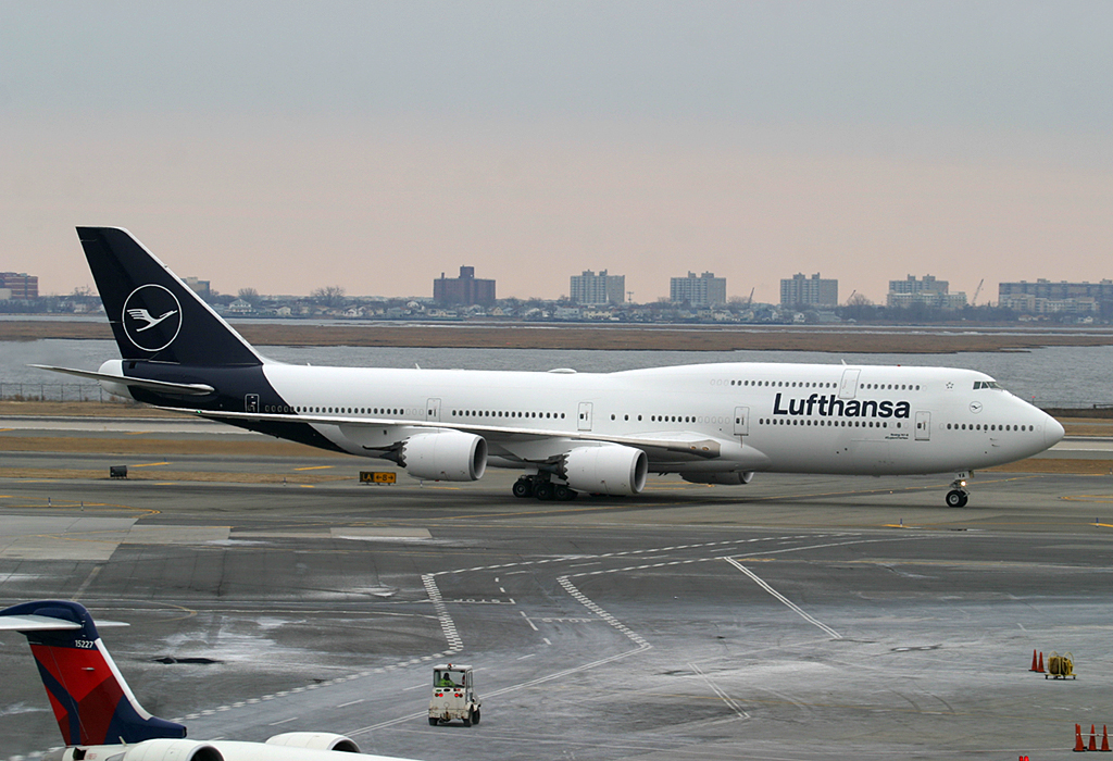
Well, props to you guys for going out to get it, but somebody was too hung over to make a serious effort designing their new livery. Either that or they think there just isn't enough nihilism in the world
I would be demanding my Euros back
-
Senior Member
I agree with you Megatop,
I think they had a great idea at first but stopped short a dropped off a cliff about 10 percent into the brain storming stage. These people on various sides of planing are severely lacking in any kind of imaginative juices, personal or professional. They make excuses for uninspiring liveries nearly ever time. Basically Lufthansa went from having the appearance of national flag Carrier to having a livery that looks like Lufthansa "LIGHT" or a regional subsidiary of the airline. Even more accurately it looks like they wet leased an Atlas Air or stored World Airways 747 from the desert for 6 months and just slapped a DLH temp white "Sticker logo" onto the already painted blue tail. I do like the tail but I wish they did more with the body. I will say I am grateful they did not oversize the logo on the tail and making it an unidentifiable and abstract design of lines and curves as we see so many airlines doing a lot these days.
Senga
Last edited by SengaB; 2018-02-10 at 07:16 AM.
 Posting Permissions
- You may not post new threads
- You may not post replies
- You may not post attachments
- You may not edit your posts
-
Forum Rules


 Reply With Quote
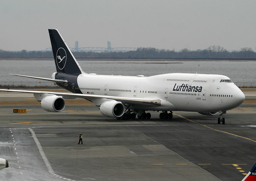

Bookmarks