It’s already been a year of change for Frontier Airlines, and there’s no slowing down for the ultra-low-cost carrier. Under new ownership and dealing with executive management changes and a new fare structure, Frontier Airlines has now announced a new livery that pays homage to its history, commitment to customers and desire to move forward.
 The new paint scheme was unveiled at Frontier’s Denver headquarters on Tuesday morning, to nobody’s surprise: The days leading up to Tuesday’s announcement were filled with news about an impending announcement and clues about a potential new livery. Frontier sent all-white aircraft models with red question marks on the tails to media members, along with an invitation to Tuesday’s unveiling. But the surprise was officially ruined when an employee accidentally posted an advertisement depicting the new livery on Facebook. To top it off, images taken of the new livery in action were circulating on social media days prior to the official announcement, and the focus on Frontier’s livery waned even further as Southwest Airlines announced a new livery the day before Frontier’s scheduled announcement.
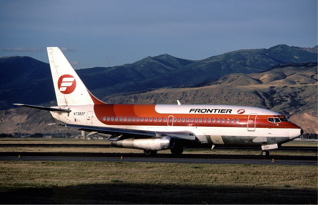
A Frontier 737 wearing the Saul Bass-designed livery introduced in 1978 (Photo: Edward Marmet).
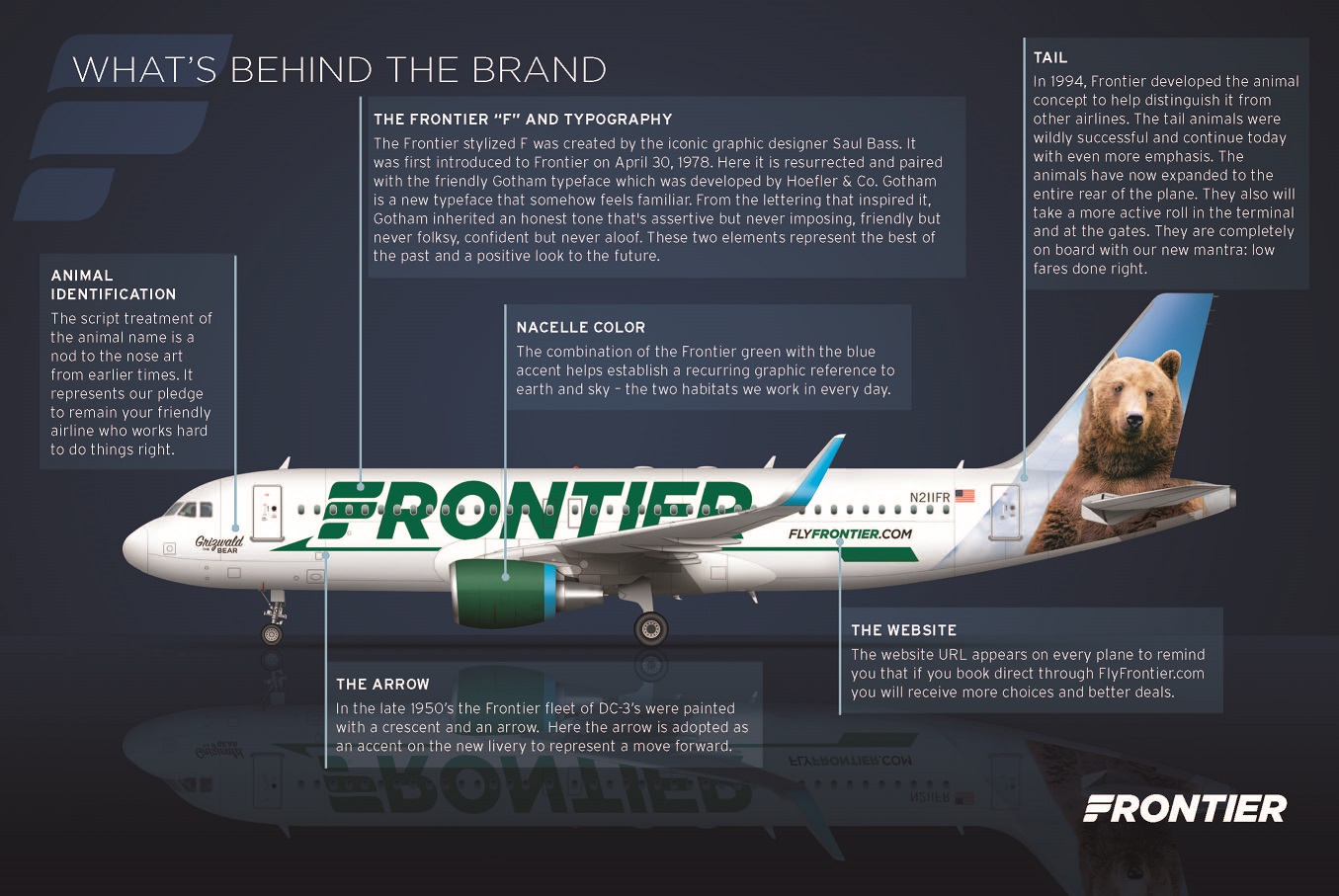
While efforts to keep the new livery a secret may have taken a nosedive (pun intended), the design is still pretty timeless. The new livery goes back to Frontier’s roots with a bold “FRONTIER” in green across the sides. It also brings back two noteworthy designs from Frontier’s past: A long arrow with a crescent that pays tribute to the fleets of DC-3s used by Frontier Airlines in the 1950s, and a stylized “F” from the 1978 logo created by the late Saul Bass.
Similar to Frontier’s DC-3s in the 1950s, the new paint scheme includes a long green arrow and crescent shape. The slim arrow underlines the new Gotham-type “FRONTIER” lettering on the side of the fuselage. According to Frontier, this newly designed green arrow exemplifies the past, but also represents moving forward.
The Frontier stylized “F,” designed by the late Saul Bass, was part of Frontier’s logo in 1978. A graphic designer and award-winning filmmaker, Bass was best known for his work in films and his famous corporate logo designs. Aviation enthusiasts know Saul Bass as the man responsible for the famous Tulip logo that United Airlines carried on its livery for over three decades. The Tulip logo, first seen on United’s livery in 1974, was replaced during the United-Continental merger in 2010. In addition, Saul Bass created Continental Airline’s “Meatball” logo, which was in use from 1966-1991, when Continental rebranded with the Globe logo. The “F” on Frontier’s new livery is a shout-out to the old Frontier logo as it looked when the airline filed for bankruptcy in 1986. Paired with the new Gotham typeface that spells out the rest of the airline’s name in the new design, it also serves as a look to the future.
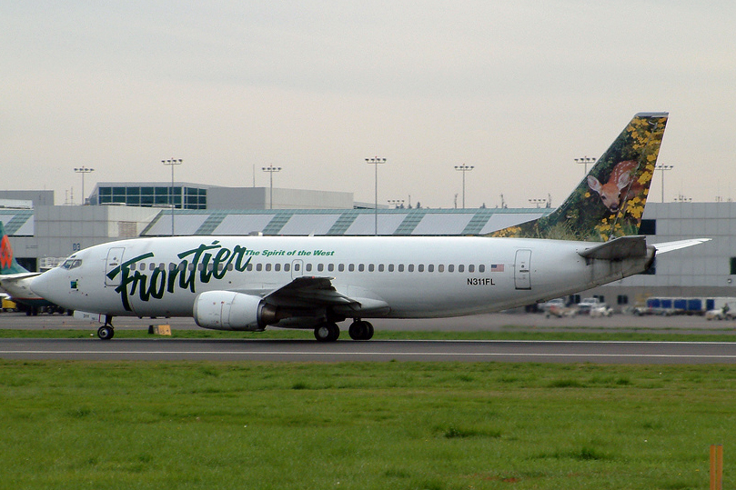
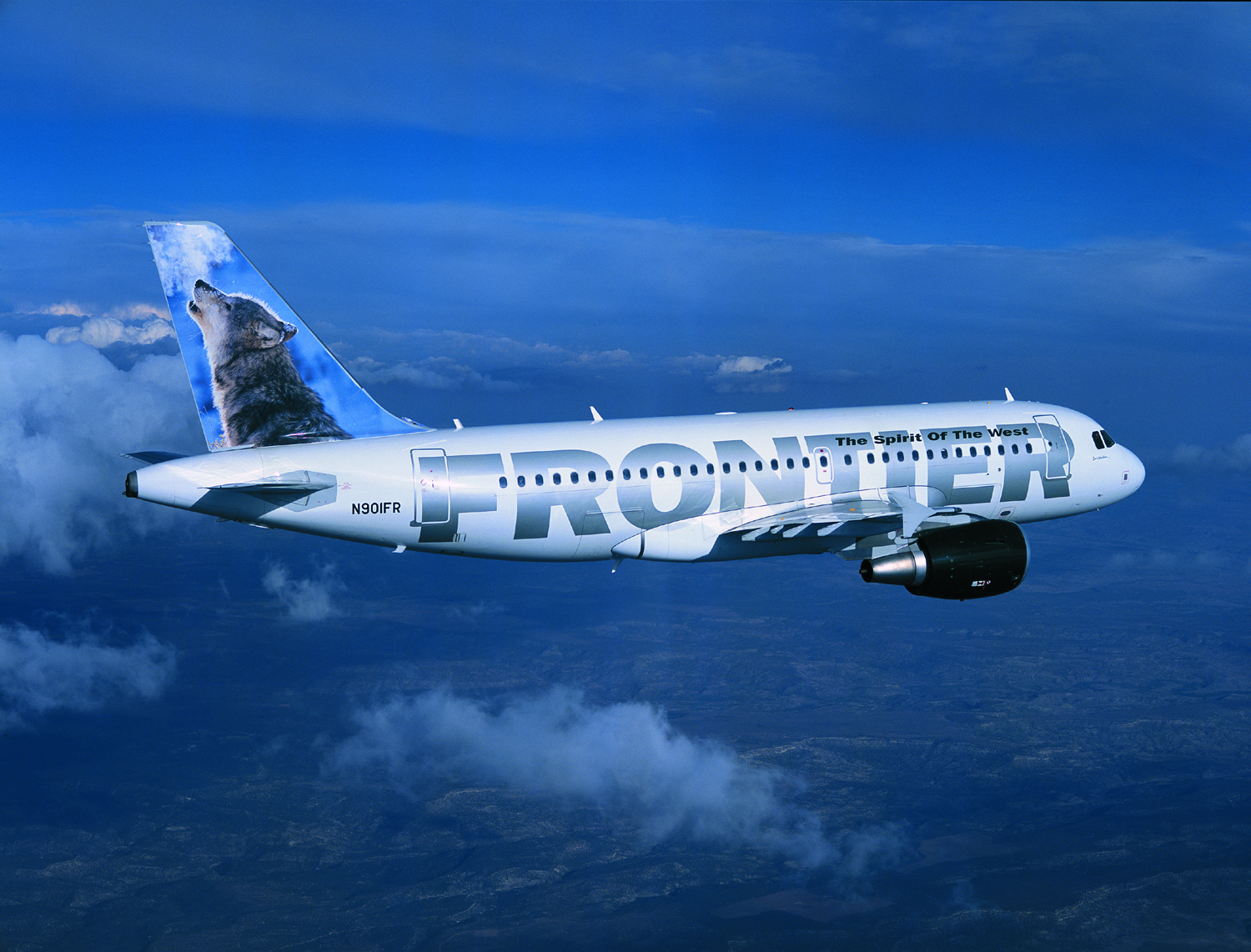
Frontier introduced the animal-themed tails during it’s 1994 relaunch. (Photo: Planephotoman/Wikipedia Commons)
The current Frontier is no stranger to livery changes. When Frontier Airlines was re-established in 1994, eight years after its bankruptcy, the company’s Boeing 737 aircraft were painted with “FRONTIER” in green cursive lettering and at an angle across the windows of the aircraft, along with their slogan, “The Spirit of the West,” in smaller letters, and also in green, just above it. In January 2001, Frontier “unleashed” the animals on the tails of the aircraft as part of a new branding scheme for the company’s new fleet of Airbus aircraft – a design that would prove to be a huge success for Frontier.
Frontier’s current color scheme (Photo: Frontier Airlines)
Frontier’s 1994 design was eventually changed to an all white airframe with “FRONTIER” in large, bold, silver letters across each side, and changed again in 2013, when “FRONTIER” was replaced with “FLYFRONTIER.COM” in a marketing scheme to highlight the company’s website, and the animal-themed tails remained. Regardless of the frequent livery changes, the company seemingly wants to keep the animal-themed aircraft around for good. The airline’s newest livery has tweaked the design of the animals on the empennage, bringing the painted animal scenes all the way down the rear of the aircraft. Additionally, each animal’s name will grace the nose of its respective aircraft in a script font – a tribute to the nose art era. And, Frontier says, the animals will also be playing a more active role at the gate and in the terminal.
Other identifying features of Frontier’s new livery include the (much smaller) presence of the company’s website URL located toward the back end of the aircraft, and a sky blue outline around the engine nacelle and on the wingtips as a reference to the earth and sky.
Frontier’s new livery is announced as an extension to the airline’s new role as an ultra-low-cost carrier and its new “Low Fares Done Right” fare structure, in which the airline aims to offer more affordable ticket prices while charging customers a la carte for items they may wish to purchase.

Frontier’s newest A320, N227FR, was unveiled in the new livery. (Photo: Blaine Nickeson – AirlineReporter.com)
Sarina Houston, Assignment Editor, is a commercial pilot and certified flight instructor who works full time as an aviation writer. You can find her at About.com or on Twitter.