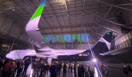
Part of me just died. I flew about 75,000 miles on American Airlines planes last year, my first flight ever was aboard an American DC-10, and I’ll always love the old Helvetica logo and minimalist livery. (Second only to the old United tulip — a symbol I’ll always connect to growing up in Chicago.)
My first thought after seeing the new American logo and type was: “Sigh.” But after watching this “making of” YouTube video, I’m trying to be optimistic. It actually looks pretty good on an airplane, and that’s what matters. The flag on the tail seems busier than necessary, but it certainly could have been a lot more offensive.
It always bugs me when companies destroy iconic brands just because they think they need a fresh look. But as I discussed yesterday, there were actual scientific reasons to make changes. And this does feel newer. After years of decay, that seems to be American’s most important message: We’re fixing shit here.
I don’t think this look will last 40+ years the way the old one did. But I think I’ll get used to this.
Btw, this was a pretty cool scene from the video, where they seem to be testing different shades of new gray paint on an old silver MD-80:
This article was originally published on SplatF and is syndicated with permission.
Dan Frommer is a technology writer, the editor of Splatf and creator of an awesome new travel guide app called City Notes.